From Facebook and Instagram to Yelp and Google Business, there are a dozen ways for organizations to maintain an online presence. But no matter how many profiles you create across these popular social media and review sites, your audience will want to visit your real home. The one not hosted by Google, Facebook, or Yelp.
I’m talking about your website. A website gives your business credibility. It’s a place to show off your brand, relay important information, answer FAQs, and publish SEO-rich articles to increase your visibility and value. But you only get a few seconds to make a positive impression when visitors arrive, so make sure it’s effective by using some of these nine modern website design trends.
1. Accessibility
Website accessibility—that is, making sure site elements like images, links, and even color schemes are kind to visitors with visual or other impairments—is more of a need than a trend. But it’s something that many businesses are only now starting to incorporate into their websites. The CDC estimates that one in four adults in the United States lives with a disability. That’s a quarter of your potential website audience!
How do you make your website more accessible to people with disabilities? Think about high-contrast viewing modes, keyboard navigation options, ARIA labels to provide invisible text descriptions on clickable fields for screen readers to read, meaningful alt text for screen readers describing your images, focus indicators, and video descriptions.
Patagonia
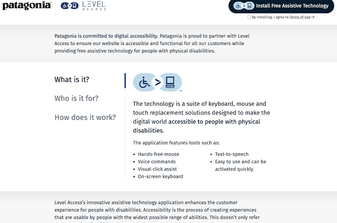
With high-contrast fonts and colors, descriptive links, and focus indicators on most buttons, the Patagonia website is already accessible to many. But if visitors need additional support, they can navigate to Patagonia’s Accessibility Statement page and Level Access page to download assistive technology.
Scope
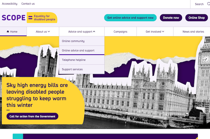
One of our favorite examples of an accessible website is Scope, a non-profit organization that promotes disability equality in the UK. The website features bold colors, focus indicators, high-contrast fonts, and an accessibility button on the page’s top-left corner, where it’s easy for screen readers and people to find. According to its accessibility page, Scope scans its site for accessibility issues every four months and provides transparency about problem areas and recent updates.
2. Custom Illustrations
It’s not hard to find a website that features unique illustrations these days. Even SaaS companies like Notion, Todoist, GitHub, and Salesforce use custom imagery to highlight their brand and products. Custom graphics give websites a personal touch. They can be whatever you need to fit your brand’s personality: playful, somber, simple, or complex.
And they’ve never been easier to make. Tools like Adobe Illustrator help artists and graphic designers create custom vector-based illustrations, drawings, cartoons, and just about any type of artwork a website designer could want. Even those of us with limited design skills can try Adobe Illustrator. Or, you can hire professionals through sites like 99Designs and get something one-of-a-kind from an experienced designer.
Duolingo
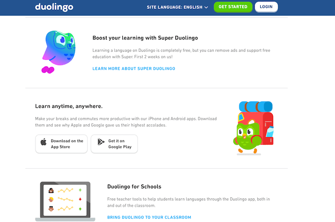
Duolingo’s adorable illustrations make learning a new language seem easy and fun. Who wouldn’t want to follow the cute little owl on a new adventure? The images work to make the concept of learning another language much less intimidating.
Notion
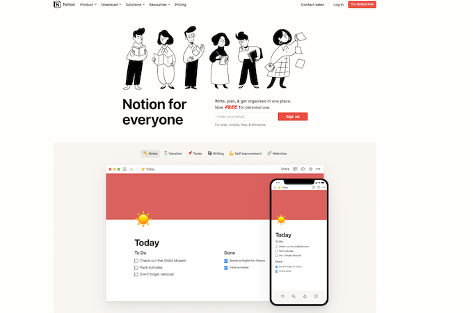
Illustrations don’t have to be colorful to look good, though. The project management software company, Notion, embraces a black-and-white color scheme as part of its brand identity. The web illustrations reflect that choice.
3. Full-Page Hero Images
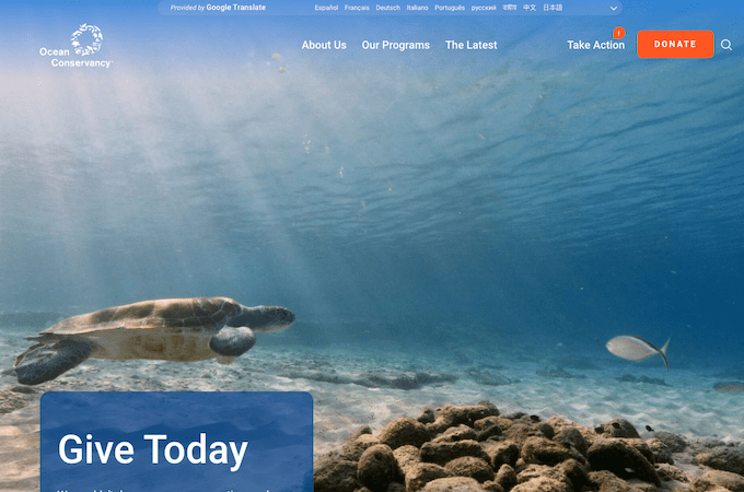
Gone are the days of limiting your hero image to the upper marquee of a website. Countless websites use full-page hero images that make us want to enter the world on the other side of our screens. The best full-page hero images are layered with just enough text to get the viewer to scroll down or select a menu option.
Too much text, and the hero image gets obscured. Too little, and a viewer might not know what action the website wants them to take. As smartphone cameras continue to get more powerful and loading speeds keep improving, we predict this website trend will hold strong for years to come.
Ocean Conservancy
Full-page hero images should support your brand. In other words, avoid stock photos if you can. Take a look at the Ocean Conservancy’s captivating hero image. It makes you feel like you’re underwater with the sea turtle. Who wouldn’t want to help keep oceans healthy after viewing it?
Yelp
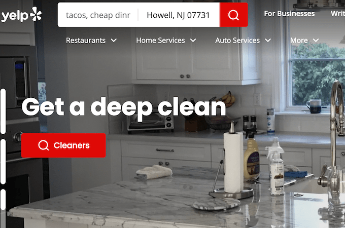
Yelp is another example of full-page hero images put to good use. Known for its local retailer and restaurant reviews, the company also wants to promote automotive, housekeeping, and painting services. Its rotating carousel of full-page header images showcases photos from business owners in each of these fields.
4. Playful Fonts
After three difficult years of pandemic-related stress, modern website design is leaning resolutely into an era of playfulness and personality. Fonts are no longer purely functional. With more font choices now than ever, people are picking typefaces that evoke a range of bold, beautiful feelings.
And with tools like Adobe Illustrator, it’s never been easier to create custom fonts if you’re up for the challenge. Either way, you can employ creative but still readable fonts to give your website a unique look.
CatScarf
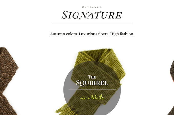
CatScarf provides custom, comfortable, high-fashion scarves…for cats. It’s quirky. It’s fun. It’s a little bit serious. The fonts on the CatScarf website reflect these brand characteristics, striking a clever balance of elegance and playfulness.
The Met
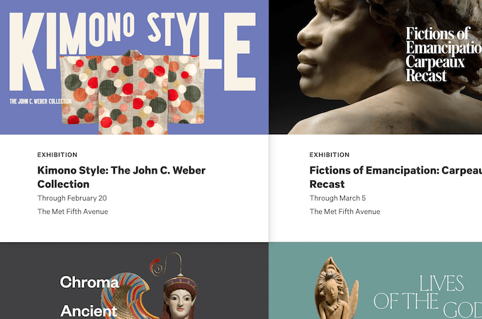
Even though conventional wisdom says to use a maximum of three fonts on a single webpage, The Metropolitan Museum of Art ignores this. Instead, it proudly displays a variety of wildly different fonts. The Met is all about art, and art is bold, diverse, and complex all at once–just like the font choices on The Met’s website.
5. Card Layouts
It’s the year of cards…at least when it comes to modern website design. Website cards are UI (user interface) units that come in square or rectangular shapes and contain bite-sized pieces of information. A website card can include several elements to display this information, such as a title, image, descriptive text, call-to-action button, link, or hashtag.
Sites like Pinterest have been using card layouts for a while, but more websites are adopting the trend for themselves these days. And why not? Cards are an easy way to fit lots of information on a page without overwhelming the viewer and provide a level of interactivity with your website.
The Met
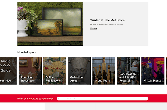
As the nation’s most-visited museum and the largest art museum in the Americas, The Met has an overwhelming amount of information to share with its website visitors. But the site is anything but cluttered. Every bit of information is broken into image-centric cards, and each card is a link that leads the viewer to a whole new webpage.
SurveyMonkey
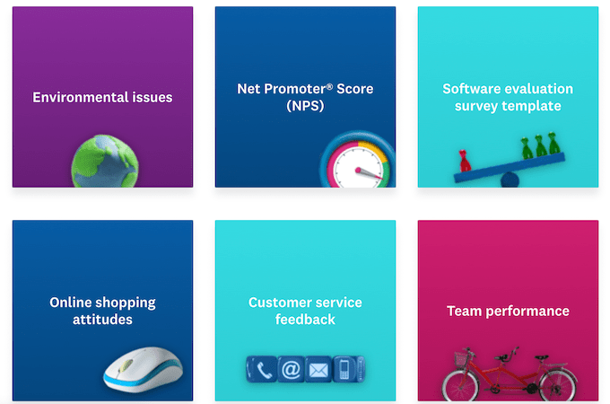
On the SurveyMonkey website, cards act as buttons that guide web visitors to the perfect survey template. Each card has a simple illustration that helps you quickly understand what type of survey it links to. It’s a clean way of presenting several options to a site visitor without creating clutter or confusion.
6. Background Videos
Modern website design is really embracing background videos instead of classic hero images since so many visitors have better internet connections or data transfer speeds via cell service. Have you noticed that a video will automatically start to play when you navigate to some sites? This puts you right in the center of the action and keeps you on the page. You can’t look away.
So, you stay on the site and keep watching the video—and then click on the text to learn more. It’s genius. A couple of years ago, background videos were limited to desktop versions of websites. But now, most smartphones have the mobile network capacity they need to quickly load and play automatic background videos.
Playa Grande
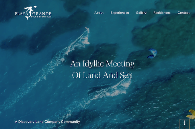
I could stare at the automatic background video loop on the Playa Grande Golf & Ocean Club website for hours. The club is in the Dominican Republic. Each video clip showcases the activities you can do at the club while surrounded by the gorgeous turquoise waters of the Caribbean Sea.
Beyond Indigo Pets
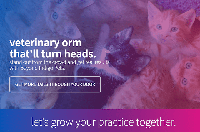
Beyond Indigo Pets, a content agency for veterinary websites, also uses a loop of background videos to highlight its services. Each clip shows a different animal turning its head to look at the camera. The overlaid text highlights the services Beyond Indigo offers, which are designed—you guessed it—to turn heads.
7. Creative Cursors
Many web designers are embracing unique cursors to add value to their websites. Instead of featuring tiny arrows, hands, or magnifying glasses that we barely see because we’re so used to them, designers are choosing bold, creative cursors.
Some contain images or text that enrich the viewer’s experience. Others activate fascinating visual and UX effects. When done well, creative cursors keep web visitors on a page just a little bit longer—and make a page unforgettable.
Kite Festival
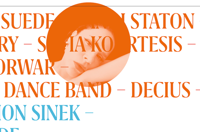
When you hover over the name of one of the musicians performing in the UK’s Kite Festival, your cursor will turn into a bright circle with a photograph of the musician inside. This helps personalize an otherwise unremarkable-looking list of names and gives each artist a slice of the spotlight.
Advanced Team
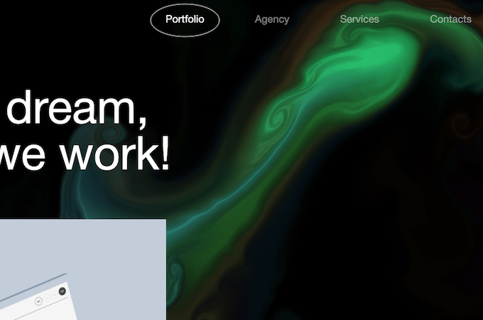
Advanced Team is a boutique website design agency, and its creative cursor showcases the best of its design abilities by leaving a pattern in the wake of cursor movements. It’s so cool that I just want to sit at my laptop and create swirl patterns all day. Yes, that green swirl you see is the cursor moving across the page!
8. Augmented and Virtual Reality
From face filters on Instagram to Home Depot’s 3D Augmented Reality feature, we’ve been using AR for a while. But the trend is only getting stronger, with sites refining and adding to their AR capabilities. Websites are also starting to implement Web VR, a type of virtual reality that allows you to step into immersive experiences with or without a VR headset.
Augmented and virtual reality can help us decide which paint colors to choose, which furniture to buy, and find places to explore. And it’s only going to get more sophisticated from here.
Google Earth
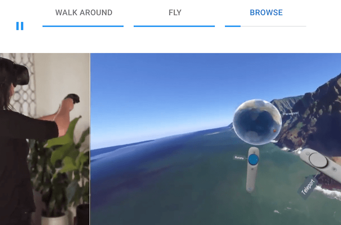
Google continues to add features and updates to Google Earth VR, a mixed-reality experience that lets you walk through Florence or fly through the Grand Canyon. You can enjoy some of the magic on your computer screen or strap on your headset for the full experience.
The Home Depot
The Home Depot introduced AR in 2015, but the technology gets better every year. You can now use the Home Depot app to visualize every detail of a build or remodel before making a single purchase.

9. Chatbots
Chatbots are popping up—literally—on more and more websites every day. They’re particularly helpful on ecommerce or SaaS sites, where the friendly little AI-powered conversational agents can answer questions or connect you with a real human.
Whether you find them annoying or helpful, they’re here to stay. And they’re getting more capable, too. Instead of only being activated when you respond to them by typing a question, chatbot developers are starting to adopt voice-enabled technology.
Slack
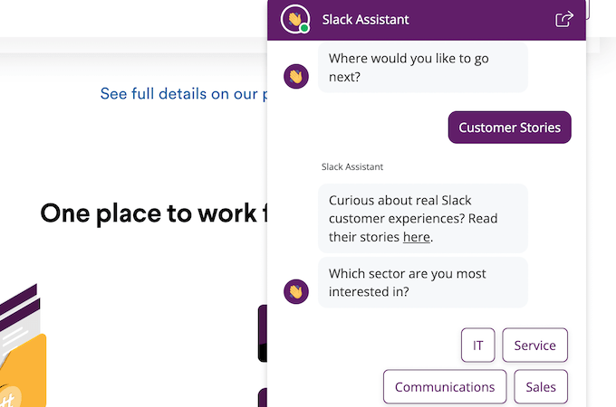
Chatbot developers got smart. It’s harder than ever to make a chatbot say silly things by asking it random questions. The Slack chatbot, for example, asks you questions and provides a range of answers for you to choose from. You can’t just type a question, and you won’t need to.
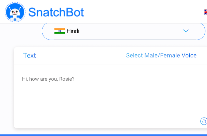
Snatchbot
Tools like Snatchbot are making it easier for people who aren’t chatbot developers or experienced coders to include chatbots on their websites to field questions from visitors and connect them with salespeople. You can even create a Snatchbot chatbot that speaks in one of 60 languages.
Final Thoughts About Modern Website Design
If you’re designing a new website or reimagining a site you haven’t touched in years, consider incorporating some of these trends to bring it into the modern ages and vie for the attention of visitors better than your competitors.
Voice-activated chatbots can increase your website’s accessibility level. Background videos showcase the best things about your brand. Playful fonts and cursors help your content stick in the mind of your web visitors. And those are just a few basic examples of how to utilize the trends we’ve spotlighted in this article.
Take a look at the 13 best design practices to help you create the coolest and most modern website around.
